Physiological Portfolio
How does your perception of my portfolio alter based on the color of the details?
Participants & Hypothesis
There were seven participants evaluated, ranging from ages 14 to 42, including peers with autism, gifted students, and neurotypical individuals. I hypothesized that my color palette and layout would need to be changed, under the assumption that the current palette would not be as effective as the typical professional layouts found in portfolios.
Timeline
The evaluation followed two stages: participants first viewed the original palette, with intervals ranging from 20 hours between the first viewing and the follow-up questions, and later viewed the altered palette with 10-second intervals for immediate comparison.
Introduction
When I initially began coding my portfolio, I had zero idea of where to start. I wanted to code the typical portfolio you would see from professionals, with a masked image of the person on the left and the text on the right, or vice versa. However, I could never feel an appeal when looking at them, and I couldn’t focus while coding it, either. After that point, I decided that I would create a portfolio that felt good to look at. I wanted it to feel like myself, with a color palette I enjoyed. Except there is so much more to appeal to than that, because everyone has their own opinions on what catches their eye. Despite that, this idea does not change the psychological behavior integrated within human interaction and experience. Because of this, I decided to analyze my color palette and how it currently interacts psychologically with viewers, and then alter it to a different appeal than what I currently have.
Background / Literature Basis
Typically, one would assume that how they see color is simply all there is to it. That the way their eyes perceive it dictates its effect. But that is not true. “What we see when we look at an object is not its 'true' physical color, says David Brainard, RRL Professor of Psychology, but our brain’s subjective reading of the spectrum.” This represents the true ideal. Color may not be something you can hold or touch; it is neurologically interpreted as something heavy to your perception. It alters consumption to what is being given, which allows marketing tactics to advertise accordingly. Similarly, when choosing colors for my portfolio, I was attracted to certain moods and palettes that create what it is currently. That is to say, warm hues and cool hues can be generalized as a group that triggers their own illustrations. “warm colors (e.g., red) generate more arousal” is what one source stated, and another expressed “it has been reported that color has been found to increase a person’s arousal (Birren, 1978), and the arousal increases memory (Roozendaal, 2002).” Another observed, “Greene, Bell, and Boyer (21), further explained that warm types of colours such as yellow, red and orange have been found to have a greater effect on attention compared to the cool type of colours like brown and gray.” Lastly, it was depicted once more: “it is reported that cool colors elicit greater relaxation and pleasure than warm colors (Jabocs & Seuss, 1975).”
Original Portfolio Color Palette + Initial Viewer Impressions
For instance, I utilize a wine red, sage green background, and a salmon pink hue to highlight the title of what I am presenting: Motion Graphics! Spanning from ages 14-17, I asked these peers to describe in three words their perception of the initial graphics of the page. The altering hues, fonts, and additional graphics were interpreted as: wonder, curiosity, appreciation, euphoric, amazement, clean, and more. This visualization was likely psychologically altered based on the palette utilized. “One colleague in particular, whom I communicated with, actually subconsciously supported this statement. Their initial thought of my motion graphics page was a keen reminder of the movie Wicked, which is known for its green and pink dynamic. Generally speaking, an individual will face remembrance of your work depending on how you utilize color theory. This tactic is primarily used in marketing strategies, but also in graphics, where creators make art such as logos and user interfaces to gain attraction.”
Altered Portfolio Color Palette
In response, I have altered the color palette of the page to a cooler hue. Now, I utilize a forest green, dimmed blue background, dark blue, and light purple hues to emphasize the message. It's interesting for me as well, as when I initially viewed the new color palette, it felt different, unique. To me, it felt more soothing to the eye than I expected. This differs from the original, where it appeals to my liking, but not solely for comfort. This provides personal insight as to how more dimmed colors can soothe the eye, making it feel like a fresher breath of air to look at; however, it makes me tired, which isn't exactly the feeling you would want someone to have when viewing your work.
Modified Palette Viewer Impressions
After creating this version, about 15 hours after my peers looked at the original pallet, they looked at the new one. I had them answer the same question: “What three words would you use to describe the feeling of this page?” One word specifically piqued my interest, “catharsis,” which, in definition, is a release of repressed emotions. Following that were “angelic” and “peaceful”. The entirety of this specific analysis supports previous observations of cool tones being typically connected to relaxation, while warmer hues are more prone to triggering arousal.
Direct Comparison of Both Palettes
To gain more insight, I proceeded to have both pages side by side. I questioned them: “Which one catches your eye first?” I was delighted to learn it was the original version. Which is intriguing, as it combines a variety of aspects. Brighter, but lighter colors, with both warm and cool hues at the same time. I gained two differing, yet similar insights. One was the appeal of pink and green together, which just happens to be complementary colors within the color wheel. It has been signaled that “Stimuli with white foreground on red background can have a higher level of contrast compared to the other colour combination.” This is fascinating to consider. As the second insight from a peer had directly responded to my previous question with a similar statement, unknowingly. The original catches their eye more because “The brighter colors make me feel stimulated.” The credibility regarding this is incredible, as this peer in particular has autism, where color has been expressed to have “An improvement of reading speed up to 35% was reported for autistic patients reading using a coloured overlay compared to autistic patients reading without using a coloured overlay.” This study was directly and naturally supported simply by my peers' genuine indications, and from only three words!
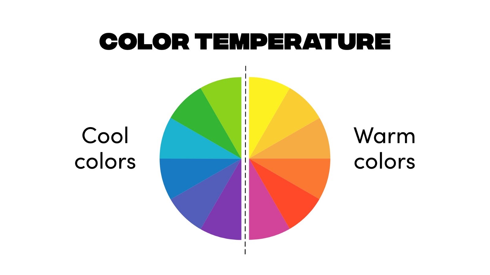
Color Wheel Comparison
Conclusion
Overall, I have deeply analyzed the possibilities that color hues have with the perception of work. With warmer hues typically arousing a viewer, while cooler hues tend to calm them. My portfolio specifically gains the best of both worlds, as I naturally created something that included both metrics. The pink and red are the warmer hues, while the sage green is the cooler hue. The ideals of these statements are not simply based on the colors themselves, as my original color palette had been described as euphoric, which is similar to warm hues, triggered arousal, and was described as “Appreciation” as well. This is very similar to the effect of cooler hues. The entirety of these observations would have determined whether alterations would be necessary for the effectiveness of my work. But to my surprise, the combination of colors I chose directly benefits the perspective of viewers, and whether they will remember my creations.
Sources Used
- Brainard, David.
Color Code.
University of Pennsylvania, School of Arts & Sciences.
https://omnia.sas.upenn.edu/story/color-code
Camm, Alisha, & Psychology Insights. Psychology of Color: Emotional Impact. https://insightspsychology.org/psychology-of-color-emotional-impact/
Dzulkifli, Mariam A., & Mustafar, M. F. (2013). The Influence of Colour on Memory Performance: A Review. Malaysian Journal of Medical Sciences. https://pmc.ncbi.nlm.nih.gov/articles/PMC3743993/
Hassan, N., & Guna, S. Color and Working Memory: Effects of Hue on Attention, Arousal, and Recall. UMass Amherst ScholarWorks. https://scholarworks.umass.edu/server/api/core/bitstreams/08667307-34f2-4e2f-9f66-7fcd5cef75ba/content